Tuscan

TRANSITIONAL TEXAS HILL COUNTRY

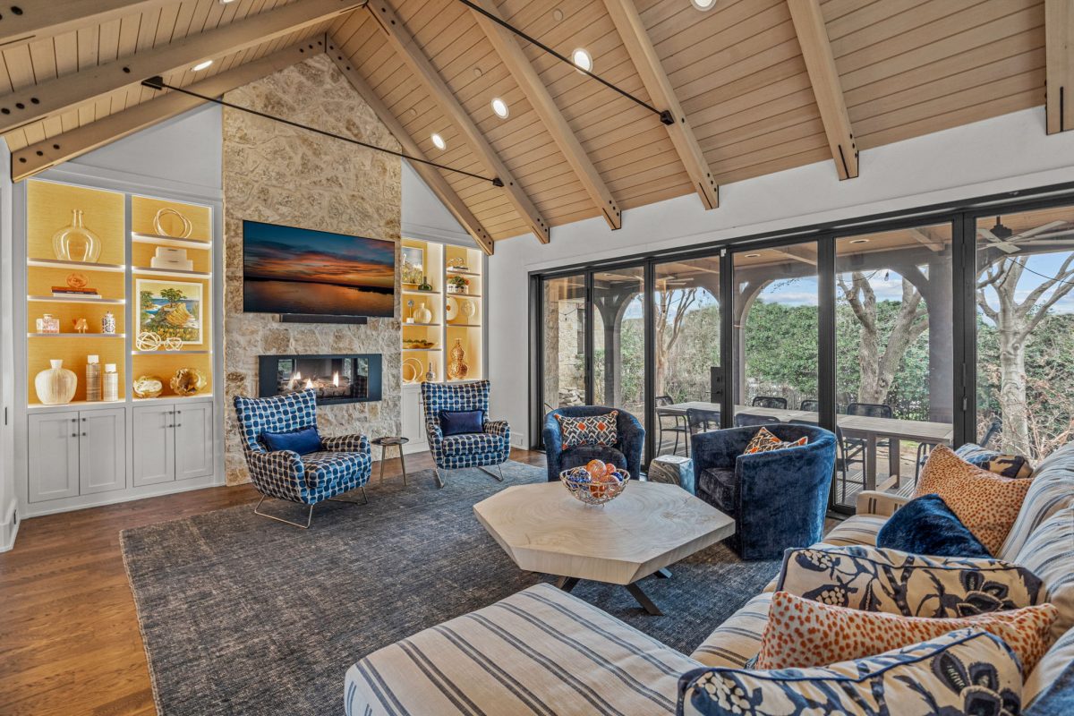
TEXAS REGIONAL VERNACULAR
Influenced by Prairie, Bungalow, and modern styles, Texas Regional architecture began to grow in popularity by the late 20th century. It started and grew as the desire for a regional architecture that reflected local traditions and building materials. Standard materials for a Texas home include colorful limestone combined with standing seam metal roofs, granite and other solid masonry.
This style has limited ornamentation usually relying on woodwork and beams to adorn the elevations. With homes usually being one room in depth, this style lends itself to more simple shapes and massing. They are more likely to include wings off the main body of the structure giving them a low yet expansive elevation. These wings give the overall floor plan a ‘C’ or ‘H’ shape.
Spanish Colonial

English Arts & Crafts

English Arts and Crafts
This is the 1st post to the new blog home, which is now fully integrated into our recently revamped company web site. If you’ve come across this post via a search engine, please take a look around at our company.

In this post, I wanted to talk a bit about the Arts and Crafts movement, and how that has impacted Architecture. The movement began in England in the mid 1800’s. Philosophers and artisans began to feel that the increasing use of the machine and mass production techniques were taking away for the aesthetic nature of things that were hand crafted. Prints, rugs, ceramics, wallpaper, furniture and architectural details were all disciplines that came together to start this movement, originally in England.
Names like John Ruskin and William Morris (whose drawing is above for a wallpaper pattern that he designed) were foremost in the movement. The intention was that everything that went into a house (including the house itself) would be artfully made, and add to the aesthetics of the work as a whole. William Morris designed and built his own house, but without any background in architectural design, it wasn’t a huge success (though it did work as a blank canvas on which to show off other crafts).

The movement was intended to be a style for the masses, but the reality is that the works of art took so much time and effort (and thus cost), it naturally wound up becoming much more of an “aristocratic” style for the wealthy. The forms of the architecture, (while allowing a fair amount of freedom in it’s expression) drew heavily from the Medieval age of Britain, a time when the peasant evolved into the craftsman who created great works of art such as cathedrals and palaces of the era.
One such architect was Charles Edwin Lutyens (1869-1944), who explored merging classical design and proportions with the medieval forms of the Tudor Revival style. Below is a small office building done for the Daneshill Brick and Tile Company.

Lutyens classical influences can be seen on the symmetrical nature of the design, but note the expressive and elaborate design of the chimney as well as the decorative false baluster across the top of the wall. Beautifully proportioned, simple massing, yet exquisitely detailed. This came to embody the Arts and Crafts movement as it grew in popularity across much of England until the early 1900’s.
Another noted architect of the movement was C.F.A Voysey (1857-1941), who took the architectural forms the medieval period and brought a clean, modern aesthetic to them. Preferring smooth, stucco and plastered exteriors over exposed masonry, he was quite ahead of his time, and his works even today could be considered what we call “transitional”.

Note the double gable of the lower image, and the angled, sloping corners. The ribbon windows are very much consistent with the Tudor Revival style, yet the overall feel of this house reveals it to be something different.
Once this movement crossed the ocean and came to American in the early 1900’s, it evolved into other architectural expressions, such as the Prairie Style (in the Midwest) and the Craftsman (or Bungalow) Style (in California). Both of these became quite popular in their own right and spread across the country.
But there is something quite interesting to me about the English expression of the Arts and Crafts style; the way it merges traditional, classical architecture with new, creative details and a modern flair that I find appealing, even though we are speaking of buildings that were designed and built over 100 years ago. While there was not much of the style produced and built here in America pre-WWII, we are finding a rediscovery of this architecture, and new traditionalists (such as our office) are creating new works based on this style (even here in Texas).
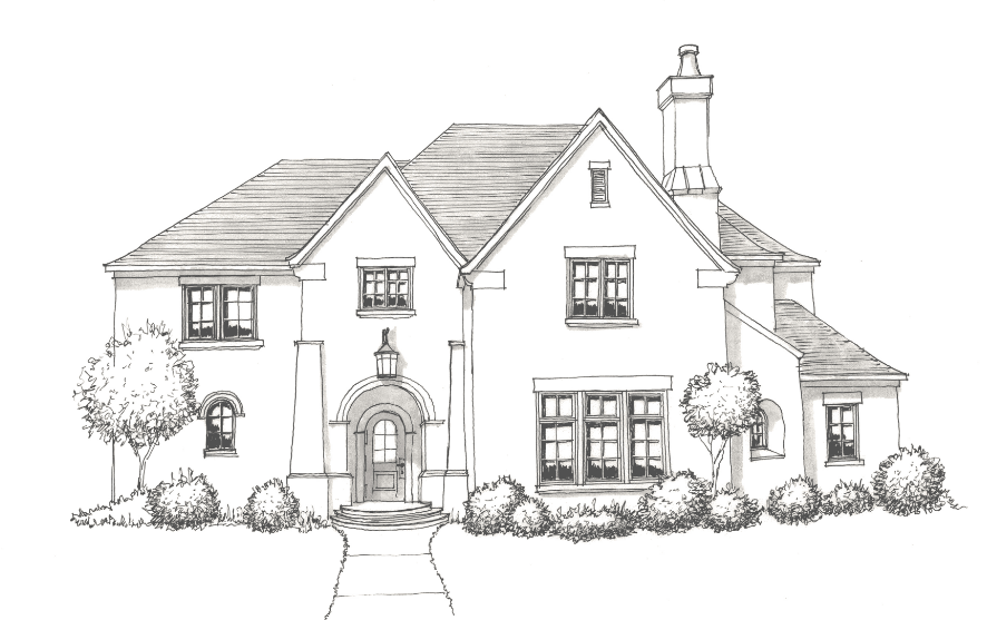
One such project for our office is currently on the drawing boards for a property in Colleyville, Texas. An early sketch of the exterior is shown below here:

The design, like the works of Voysey, will be a stucco exterior and merge a more “clean”, modern look with the traditional forms of Tudor Revival style. I’ve personally found it quite rewarding to research and attempt to recreate this style in the finest traditions of the Arts and Crafts movement.
Designing a “Kaleidoscope of Homes” Show House

Every once in a while, if you are lucky, you get to work an a project that takes your career to a new level. About a year ago I had the opportunity to sit down with Scott Simmons of Simmons Estate Homes and design a jewel of a house with him. This house would eventually be Scott’s entry into the 2010 Kaleidoscope of Homes show, a luxury home tour that has been running in the DFW are for twenty years now. Our plans for this house were grand- we intended from the very 1st meeting to design something of lasting impression, and in my mind, a work of art. In most respects, I think we succeeded.
Scott was fairly certain that he wanted to do something of mediterranean influence. However, we both wanted to avoid the trendy “Tuscan” design that had been overdone in our area. In researching the various forms of and styles of architecture, we came across the works of George Washington Smith, an Architect in the Santa Barbara region of California from the early 1900’s. Smith’s houses were defined as a style called “Spanish Colonial Revival”, and we both knew that the aesthetics of this style were what we wanted to express in our design.

I poured over books detailing Smith’s houses from both the exterior and interior. They were based on simple farmhouses of the Andalusian region of Spain, and yet, Smith was able to interject details of the Spanish Baroque movement in key areas. The massing of his homes were both simple and sophisticated at the same time. I made careful sketches and studies of the proportions that Smith employed in his designs and, to the best of my abilities, attempted to stay true to that aesthetic. We also took a very deliberate and careful approach to outdoor spaces. Our design makes use of three very significant ones. To the front is a large terrace with a fountain and a freestanding fireplace. Large trees were planted to the southwest of this terrace to provide some natural shade during the day, although it’s uncovered nature will probably keep it from being heavily used during the day in mid-summer, it is still a fantastic space and one that people have used extensively during the cooler weather of the show in October.

Probably the most significant outdoor space is the main Outdoor Living Room, which is located right next to the Great Room in the house. The front door lines up with the center arch, and provides a fantastic line of sight from the foyer all the way through the fountain at the pool and beyond to the water display behind the property. Another interesting feature is a large 6 panel sliding french door system. All 18 feet of this door system separating the Great Room from the Outdoor Living Room slides into wall pockets and lets the two spaces flow seamlessly with each other.
Below are some additional photos of the exterior and interior of the house. As of today, the finished house is a total of 9500 s.f. (a/c) and has 5 bedroom (including the one in the 600 s.f. separate Guest House) 6 full baths and 2 half baths, a Catering Kitchen in addition to the main Kitchen, 4 car Garage, downstairs Billiard Room, upstairs Play Room (with Popcorn Bar) and a private Wine Room and Wet Bar with adjacent Patio. Should you have a chance, do come out to the show and tour this house for yourself- I consider it one of my finest works to date.


For more information about the Kaleidoscope of Homes, visit www.theKofH.com.
Identifying the “Tudor” House.
Tudor is a category that it seems a lot of homes fall into. But what really makes a Tudor house authentic, and where did the style originate from? I want this posting to be a bit more informative and answer some of these questions.
The term “Tudor” itself is a bit misleading. There was, obviously, the Tudor Period in English History (1485-1603), which the name is directly derived from. But from an architectural standpoint, the Tudor Revival style that American houses are classified as are really based on a much broader historical reference of medieval English architecture, including the Jacobean and Elizabethan eras. What is considered Tudor Revival may also sometimes be referred to as “Tudorbethan” or “Jacobethan”, but they are essentially different names for the same architecture.

Some of the earliest examples of the style originate with Norman Shaw, such as with his house “Cragside”, built in 1863 in Northumberland, England. The house made extensive use of half timbering, 4 point (or “tudor”) arches, heavy masonry detailing and massive, elaborately detailed masonry chimneys. Also of note were the steeply pitched roofs and cross gables and the joining of multiple windows for a larger expanse of glass, or a ribbon effect.

As the style evolved and came eventually to America, it reached the height of it’s popularity from the 1920’s through the 1940’s. Some of the identifying feature of the style include: A) Prominent front facing cross gable with steeply pitched roof, B) Massive and elaborate masonry chimney, C) Groupings of multi-pane rectangular windows, D) False half timbering, and E) Mix of materials may include stone, stucco, brick and rough wood.

Some examples of the work I have produced at my firm which fit into this style are shown in the following examples. Here is a fairly nice watercolor rendering done of a charming country house that incorporates all the aspects of Tudor Revival architecture talked about above.

In this example of a larger and more traditional house, again we see all the elements of Tudor Revival architecture are here. The entry has a more defined entry in cast stone, and as this house was designed for a corner lot, the house presents itself well from the corner and the side elevation. A more traditional “hood mould” goes over the top of the windows, and provides a functional use of pushing water away from the face of the glass as well as a decorative element.

In this last example of a smaller house, we can see the front gable becomes asymmetrical for the entry with a more modest use of stone as an accent. The front chimney provides some architectural interest for the design also, and the lintels above the windows here are a simple but well crafted rough wood.
I hope that gives you a far understanding of the Tudor style, hopefully I will be expanding on some other architectural styles. As always, feel free to leave relevant comments or questions and for more examples of my work, please check out my website at Heritage Design Studio
Putting Advice to Paper
Well, the blog has been left alone for a while now. As I come back to it and look at what has been posted, I want to provide an example of what can be done with the advice I’ve given here. So, I’m going to post one of my designs from earlier this year. I think incorporates many of the interior and exterior aspects of a well designed house, but I welcome your feedback.
First, let me start with the exterior:

From a stylistic standpoint, I would classify it as an “English Cotswold” design. Now, I’m sure some of you are going “costwold”?- What IS that?? Well, Costwold is a region in England know for it’s simple stone houses and charming medieval towns (in fact, there is actually a cotswold stone that comes from the region). The forms of the houses in that region are very similar to Tudor Revival architecture, but a bit simpler. They are usually done in a stone exterior as well. You’ll note a lot of windows across the design, which are in fact groups of 3 or 6 smaller windows mulled together- no arches EXCEPT at the front door. Also, note how simple the roofline is- one very clean ridgeline at the top. Finally, let me point to the use of 1 material (in this case stone) throughout the entire exterior (except for the chimney, which the upper half is shown as brick, but ideally something tonally matching the stone). The design is very clean, and doesn’t rely on fancy patterns or strong contrasting colors to draw the eye to it.
Next, let’s look at the floor plan:

Now, let me say that this plan is perhaps a bit on the large size, but not outrageously so. The plan is 3950 s.f. for the air conditioned space. At 65′ wide, the design is relatively narrow. It has 2 downstairs living areas, an optional elevator, 3 car tandem garage, and 4 bedrooms with a study/ library. The plan has only one dining area, so instead of a Breakfast Nook, the Kitchen has an eat-in bar. The layout may resemble an old design where the space at the front would be served as a Formal Living Room, however by adding a bar and a space for a large screen TV, the space next to the foyer in this plan now serves as a Game Room, with sofa facing the TV against the back wall and game table (perhaps pool table) in the center. The large window between floors to the right of the entry allows light into the Foyer and the Dining Room. Finally, note the Master Bath, which separates the bathing areas from the sink and toilet. The Master Closet opens to a smaller Utility room, while the upstairs (not pictured) has a secondary washer dryer to accommodate the upstairs bedrooms. A double sided fireplace is shown in the version between the Owner’s Spa and the Master Suite itself.
Finally, I’ve also done a sketch of the Family room looking back towards the eat-in Kitchen. I’m obviously showing some elaborate truss work here in this sketch, but that could be scaled down to something simpler should cost be a factor.

I hope you find this design interesting, and hopefully it will lead you in new directions and thinking about how a house can be laid out, though truthfully the innovations here are hardly ground-breaking. I welcome any feedback or questions.
Hopefully my next post will be sooner than later!
Emerging Ideas in Floor Plans
My last few posts (from a few months ago- sorry!) focused mostly on the exterior trends and what was being done wrong and what could be done instead. I’ve spent very little time so far talking about plans or layouts for a couple of reasons. For one, plans are a very personal and subjective aspect of house design, and if you ask a dozen people what rooms they want in their house, you’ll get a dozen different answers. For another, plans will vary quite a bit as you travel across the country, and what is popular or acceptable in one region may not be the case in another, making predications and recommendations difficult.
However, we are seeing some things recently that are causing people to change what they are looking for in a home. First off, I think that most people are changing their lifestyles slightly; in other words, rethinking how they use the spaces in their homes. Secondly, either because of the economy or due to concerns over ecological responsibility (or both), the trends seems to be pointing towards smaller homes. Most of the battle for the smaller home is fought on the first floor, since that is considerably more expensive area to build than the 2nd floor (with a “slab on grade” house, as most Texas homes are). Unfortunately, the trend for smaller is also fighting with the trend to place more and more of the entertaining spaces downstairs.
Regardless, I have designed several homes this year with some different philosophies in their layout, and while I’d hesitate to call it a “trend”, at this point, it probably merits at least a report.
1) Separation of Formal and Informal spaces:
Not very long ago, the trend was that a larger home had to have a formal living room and a family room, as well as a formal dining room and a casual dining room (or ‘breakfast nook’). People bought very nice furniture to put in the formal spaces and more relaxed pieces for the informal ones.
Recently, people have begun to realize that, for the most part, these formal spaces were used very infrequently and took on a sort of “home museum” feel to them, being mostly wasted space except for special occasions. The formal living room has all but disappeared in most of the houses I design, and I am seeing the Formal Dining start to follow suit. Part of this is also due to the trend of furniture beginning to blur the line between casual and formal. ‘Distressed’ pieces are a very common item now and fit well in either formal or casual environments.
In our designs, it is very common now to oversize the family room and have the house as a ‘single living area’ home. Often we will vault these spaces and let the line between formal and casual blur in the home as well. The fact is, people spend their time in the family room, and they want it to be a nice, large, appealing space.
We have also experimented with eliminated the formal dining room in some of our designs. One way to do this is to place a very large single dining area (or ‘semi-formal’ dining) that opens up to (or is actually part of) the family room. Part of what also makes people more comfortable with this concept is to have a kitchen with an island large enough to be considered and ‘eat-in’ kitchen.
2) The Entertaining Spaces
Another common feature of a home was that it had to have a space that could be used as a home theater, as well as a separate ‘Game Room’ whose sole purposed seemed to be to house a pool table that rarely got used. These rooms were almost always placed on the 2nd floor of the home and, as the formal spaces of previous designs, became parts of the home rarely visited.
We have begun doing 2 things in rethinking these spaces. One is to join these individual rooms into a single space. Picture either an ‘L’ or ‘T’ shaped room with the large flat screen TV or projection screen being against the wall of the appendage space. This allows for furniture to be placed so that the same space can hold typical game room equipment (pool table, poker table, shuffleboard, etc) and yet also have a large sofa or 2 separating these spaces. Functionally, the room can now fit a variety of activities simultaneously.
The other aspect is that, wherever possible, our designs are now placing these spaces downstairs instead of up. While this can be a challenge and is not always possible on smaller homes, the result is a space that become much more usable on a day to day basis for the adults.
3) Reducing where possible
As I said earlier, while some of these spaces are moving downstairs, the overall trend is that these homes are getting smaller overall, and that has to happen on the ground floor for it to be a significant financial savings. Eliminating formal spaces is one way, but that area is then usually given to increasing the size of the family or semi formal dining, or towards moving entertaining spaces downstairs. There are some possibilities in reducing size though.
Grand staircases at the entryway make for dramatic foyers. They also are expensive and take a lot of square footage to do. One way to save space is to move away from the stair hall at the foyer and have a less grand, more functional staircase close to the kitchen. In circumstances where the entertaining spaces are mostly downstairs anyways, a grand staircase makes less sense from a practical standpoint as well.
Master baths are a space that have also grown over the years. Some people have used size instead of something well laid out to impress. In several houses lately, I have designed much smaller bathrooms. One way to get around the reduced size is to spatially separate the sinks from the bathing and shower area. The bathing area can then take on the aspect of being it’s own “spa retreat” instead of simply slapping a tub in the center of the master bath or in front of the only window. As the tub moves into it’s own space, it’s important for the sink area to still maintain as much natural light as possible, so why not leave a smaller bench or window seat in front of the window where the tub used to be?
Master closets can get notoriously large, and one of the things that people will frown upon if it’s too small. One solution that we came up with was to place a cedar lined closet on the 2nd floor above the master closet, with a dumb waiter for moving winter/ summer clothes back and forth. This allowed us to put a much smaller closet downstairs and yet still have a great deal of clothes storage.
Utility rooms also have grown in size, and that trend seems to be reversing. Placing the 2nd refrigerator (or freezer) in another location allows the room to get smaller. We have also begun placing smaller, secondary utility rooms upstairs (just big enough for a washer dryer and a cabinet or 2) and the main laundry room in most of our current design now has access to the Master Closet directly for convenience.
These are some of the innovations that I have come up with over the past couple of years in designing homes for my clients. While not all of the ideas will appeal to everyone or make sense for every living situation, they may help to spark some new ideas for you or perhaps begin to rethink how you want to live in your next home.
Until my next post!